> ## Documentation Index
> Fetch the complete documentation index at: https://help.scribe-mail.com/llms.txt
> Use this file to discover all available pages before exploring further.
# Button blocks
> Add clickable call-to-action buttons to your email signature, set the label and link, and style them with plain or stroke types, colors, and rounded corners.
Buttons are clickable calls-to-action like "[Book a demo](/en/can-i-add-a-book-a-demo-call-to-action-for-my-sales-team-email-signatures)", "Visit our website", or "Download our app." They stand out visually and drive clicks to your most important links.
 ## Button content
| Setting | What it does |
| -------- | ---------------------------------------- |
| **Text** | The label displayed on the button |
| **Link** | The URL the button links to when clicked |
## Style
| Setting | What it does |
| ----------------- | ------------------------------------------------------------------------------------- |
| **Type** | **Plain** (solid background) or **Stroke** (outline only with transparent background) |
| **Color** | Button background color (for Plain) or border color (for Stroke) |
| **Border radius** | Corner rounding: `0` for sharp corners, higher values for rounded corners |
| **Color presets** | Quick-select from gradient and solid color presets for fast styling |
Use **Type → Plain** with your brand color for primary calls-to-action like "Book a demo." Use **Type → Stroke** for secondary actions that should be visible but less prominent.
## Text styling
Font, size, color, opacity, line height, and formatting options for the button label text.
## Size
Set the button's **Width** and **Height** in pixels.
## Layout
Padding controls the space around the button block.
## Related articles
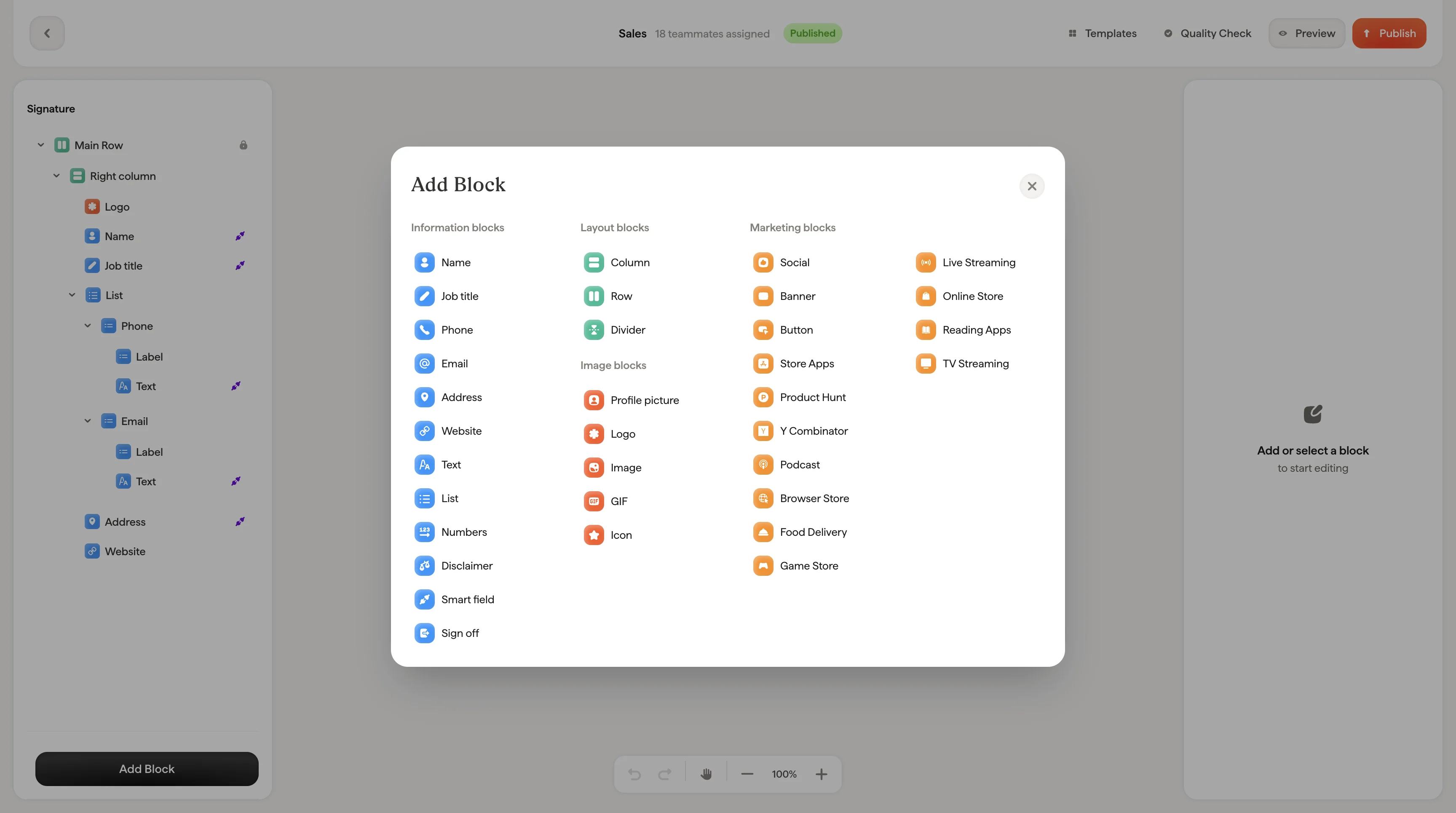
* [Add blocks](/en/editor/add-blocks)
* [Social icons](/en/editor/social-icons)
* [Badge blocks](/en/editor/badge-blocks)
## Button content
| Setting | What it does |
| -------- | ---------------------------------------- |
| **Text** | The label displayed on the button |
| **Link** | The URL the button links to when clicked |
## Style
| Setting | What it does |
| ----------------- | ------------------------------------------------------------------------------------- |
| **Type** | **Plain** (solid background) or **Stroke** (outline only with transparent background) |
| **Color** | Button background color (for Plain) or border color (for Stroke) |
| **Border radius** | Corner rounding: `0` for sharp corners, higher values for rounded corners |
| **Color presets** | Quick-select from gradient and solid color presets for fast styling |
Use **Type → Plain** with your brand color for primary calls-to-action like "Book a demo." Use **Type → Stroke** for secondary actions that should be visible but less prominent.
## Text styling
Font, size, color, opacity, line height, and formatting options for the button label text.
## Size
Set the button's **Width** and **Height** in pixels.
## Layout
Padding controls the space around the button block.
## Related articles
* [Add blocks](/en/editor/add-blocks)
* [Social icons](/en/editor/social-icons)
* [Badge blocks](/en/editor/badge-blocks)