> ## Documentation Index
> Fetch the complete documentation index at: https://help.scribe-mail.com/llms.txt
> Use this file to discover all available pages before exploring further.
# List blocks
> Show phone, email, and address details in your email signature with list blocks, choosing items per row, icon styling, dividers, and label formatting.
Lists display structured information like phone numbers, email addresses, and office locations. They combine an icon, a label, and a value into clean, scannable rows.
 ## Items per row
Choose between one, two, or three items per row depending on how much information you want to display and the available space in your signature.
* **One item per row**: Each piece of information on its own line. Best for short lists or when readability is the priority.
* **Two items per row**: Pairs information side by side. Good for saving vertical space with 4-6 items.
* **Three items per row**: Compact display. Works best when items have short values.
## Style
Each list item can display with an icon alongside the text. The icon styling options are the same as [social icons](/en/editor/social-icons):
| Setting | What it does |
| ------------------- | ---------------------------------------------------------------------------------------- |
| **Format** | Toggle between **Icon** (shows a visual icon) or **Text** (shows the label as text only) |
| **Variant** | Icon fill style: **Plain**, **Empty**, or **Stroke** |
| **Shape** | Icon container shape: **Square** or **Circle** |
| **Icon color** | Color of the icon |
| **Icon background** | Background color of the icon container |
| **Size** | Icon size in pixels |
## Text styling
Font, size, color, opacity, line height, and formatting options apply to the text content of each list item.
## Layout
| Setting | What it does |
| ----------------- | ----------------------------------------------------------------------------------------------- |
| **Item Gap** | Space between list items |
| **Label Gap** | Space between a label (like "Phone") and its value |
| **Divider** | Add a visual separator between items: choose **None**, **Dot**, **Vertical**, or **Horizontal** |
| **Divider color** | Color of the divider when one is selected |
| **Padding** | Space around the entire list block |
## List labels
Labels like "Phone", "Email", or "Address" appear above or beside each list item value. Each label can have its own link and text styling, independent of the item values themselves.
This is useful when you want the label to be a different color or size than the value. For example, a lighter gray label with a dark value.
## Related articles
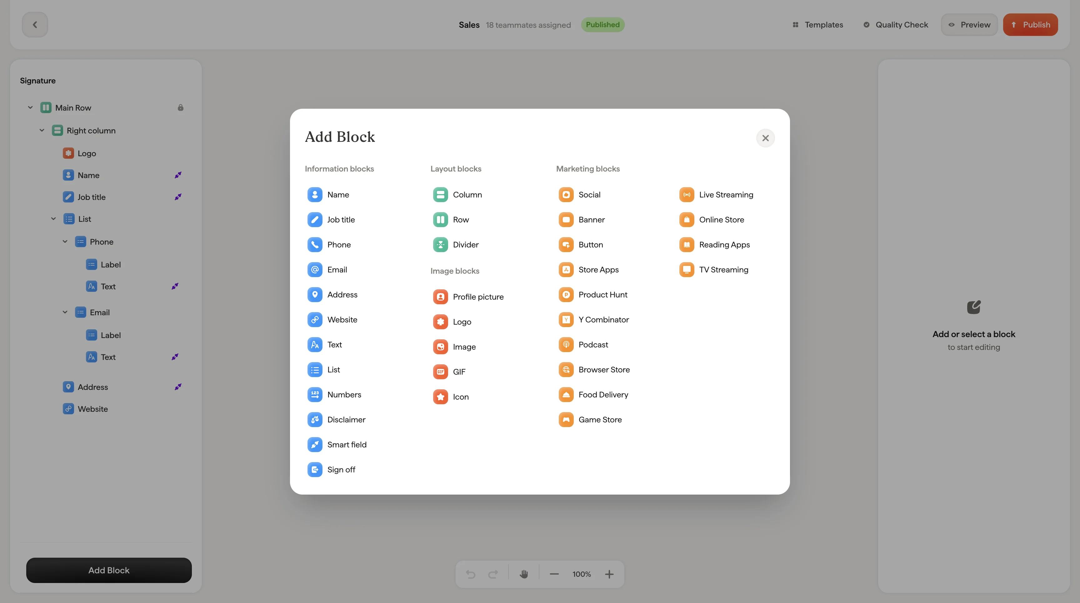
* [Add blocks](/en/editor/add-blocks)
* [Text blocks](/en/editor/text-blocks)
* [Styling panel](/en/editor/styling-panel)
## Items per row
Choose between one, two, or three items per row depending on how much information you want to display and the available space in your signature.
* **One item per row**: Each piece of information on its own line. Best for short lists or when readability is the priority.
* **Two items per row**: Pairs information side by side. Good for saving vertical space with 4-6 items.
* **Three items per row**: Compact display. Works best when items have short values.
## Style
Each list item can display with an icon alongside the text. The icon styling options are the same as [social icons](/en/editor/social-icons):
| Setting | What it does |
| ------------------- | ---------------------------------------------------------------------------------------- |
| **Format** | Toggle between **Icon** (shows a visual icon) or **Text** (shows the label as text only) |
| **Variant** | Icon fill style: **Plain**, **Empty**, or **Stroke** |
| **Shape** | Icon container shape: **Square** or **Circle** |
| **Icon color** | Color of the icon |
| **Icon background** | Background color of the icon container |
| **Size** | Icon size in pixels |
## Text styling
Font, size, color, opacity, line height, and formatting options apply to the text content of each list item.
## Layout
| Setting | What it does |
| ----------------- | ----------------------------------------------------------------------------------------------- |
| **Item Gap** | Space between list items |
| **Label Gap** | Space between a label (like "Phone") and its value |
| **Divider** | Add a visual separator between items: choose **None**, **Dot**, **Vertical**, or **Horizontal** |
| **Divider color** | Color of the divider when one is selected |
| **Padding** | Space around the entire list block |
## List labels
Labels like "Phone", "Email", or "Address" appear above or beside each list item value. Each label can have its own link and text styling, independent of the item values themselves.
This is useful when you want the label to be a different color or size than the value. For example, a lighter gray label with a dark value.
## Related articles
* [Add blocks](/en/editor/add-blocks)
* [Text blocks](/en/editor/text-blocks)
* [Styling panel](/en/editor/styling-panel)