> ## Documentation Index
> Fetch the complete documentation index at: https://help.scribe-mail.com/llms.txt
> Use this file to discover all available pages before exploring further.
# Social icons
> Add clickable social media icons to your email signature for LinkedIn, Instagram, and more, then style them by format, variant, shape, color, and size.
Social icon blocks let you display your social media profiles as clickable icons or text links. You can add them individually or as a group using the social list block.
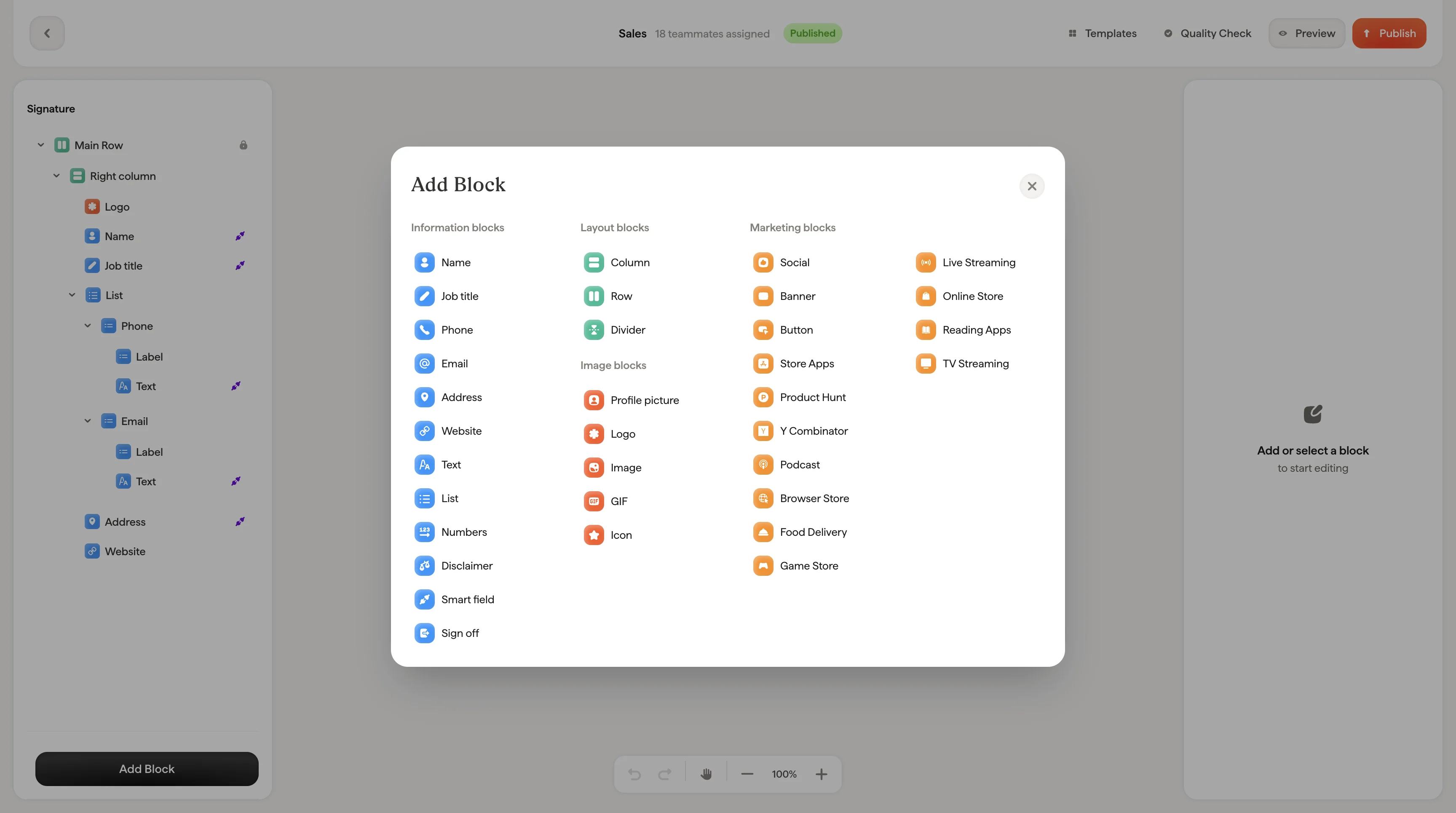
 ## Icons grid
The icons grid shows all available social platforms: LinkedIn, Twitter, Facebook, Instagram, YouTube, Pinterest, Google, Vimeo, Snapchat, Behance, Figma, GitHub, and more.
Selected icons appear highlighted. Click the **+** button to browse the full library and search for specific platforms.
Each selected platform has a URL input where you enter your profile link.
## Style
| Setting | What it does |
| ------------------- | ------------------------------------------------------------------------------------------------------ |
| **Format** | Toggle between **Icon** (shows the platform logo) or **Text** (shows the platform name as a text link) |
| **Variant** | Icon fill style: **Plain** (solid fill), **Empty** (outline only), or **Stroke** (line-drawn) |
| **Shape** | Icon container shape: **Square** or **Circle** |
| **Icon color** | Color of the icon itself |
| **Icon background** | Background color of the icon container |
| **Size** | Icon size in pixels |
Use **Variant → Plain** with **Shape → Circle** for a modern, clean look. Switch to **Variant → Stroke** for a more minimal aesthetic.
## Layout
Padding controls the space around the social icons block.
## Social list vs. individual icons
The **social list** block groups all your social icons together with shared styling. Change the variant or shape once and it applies to every icon in the list.
An **individual social icon** block gives you independent control over a single icon's appearance. Use this when you want one icon styled differently from the others. [List blocks](/en/editor/list-blocks) use the same icon styling for contact details like phone and email.
## Related articles
* [Add blocks](/en/editor/add-blocks)
* [Button blocks](/en/editor/button-blocks)
* [Styling panel](/en/editor/styling-panel)
## Icons grid
The icons grid shows all available social platforms: LinkedIn, Twitter, Facebook, Instagram, YouTube, Pinterest, Google, Vimeo, Snapchat, Behance, Figma, GitHub, and more.
Selected icons appear highlighted. Click the **+** button to browse the full library and search for specific platforms.
Each selected platform has a URL input where you enter your profile link.
## Style
| Setting | What it does |
| ------------------- | ------------------------------------------------------------------------------------------------------ |
| **Format** | Toggle between **Icon** (shows the platform logo) or **Text** (shows the platform name as a text link) |
| **Variant** | Icon fill style: **Plain** (solid fill), **Empty** (outline only), or **Stroke** (line-drawn) |
| **Shape** | Icon container shape: **Square** or **Circle** |
| **Icon color** | Color of the icon itself |
| **Icon background** | Background color of the icon container |
| **Size** | Icon size in pixels |
Use **Variant → Plain** with **Shape → Circle** for a modern, clean look. Switch to **Variant → Stroke** for a more minimal aesthetic.
## Layout
Padding controls the space around the social icons block.
## Social list vs. individual icons
The **social list** block groups all your social icons together with shared styling. Change the variant or shape once and it applies to every icon in the list.
An **individual social icon** block gives you independent control over a single icon's appearance. Use this when you want one icon styled differently from the others. [List blocks](/en/editor/list-blocks) use the same icon styling for contact details like phone and email.
## Related articles
* [Add blocks](/en/editor/add-blocks)
* [Button blocks](/en/editor/button-blocks)
* [Styling panel](/en/editor/styling-panel)