The options you see depend on the block you’ve selected. A text block shows font and color settings. An image block shows size and crop options. Each block type has its own set of controls.
How it works
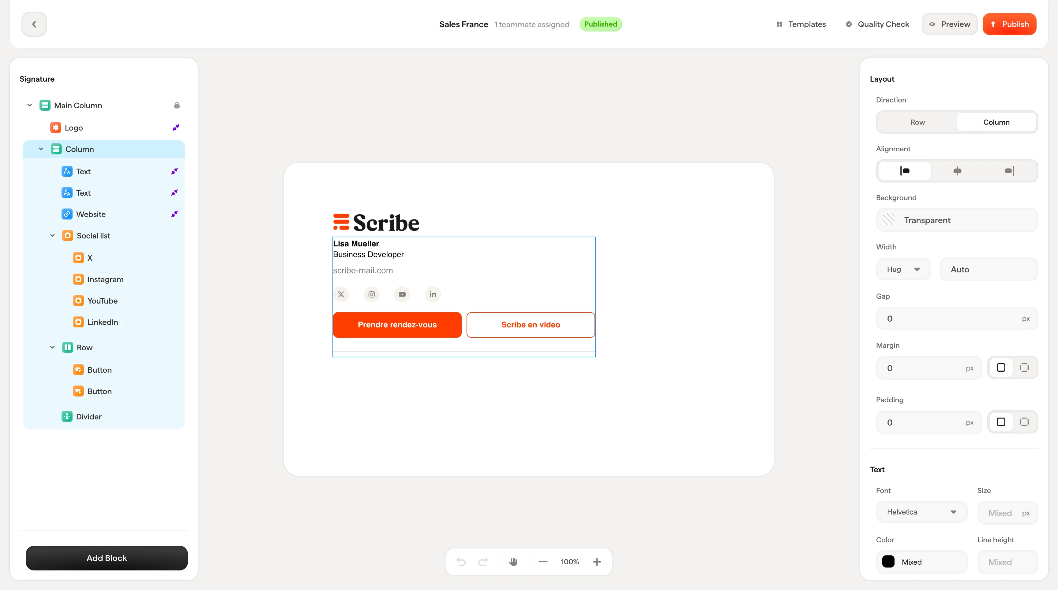
The styling panel is organized into consistent sections that appear depending on the block type:- Content settings: What the block contains (text values, Smart Field connections, image source, links)
- Style: How it looks (colors, fonts, formatting, icon variants)
- Size: Dimensions when applicable (width, height)
- Layout: How it sits in the signature (padding, gap, alignment, direction)
Common controls
These controls appear across multiple block types and work the same way everywhere.Padding
Every block has padding controls in its Layout section. Padding is the space between the block’s edge and the surrounding elements. You can set padding globally (one value for all sides) or expand the control to set each side individually: Top, Right, Bottom, Left.
Color picker
Anywhere you see a color field, clicking it opens the color picker with:- A color gradient selector for visual picking
- A hue slider for selecting the base color
- A hex input for entering exact color values
- Your Brand Colors at the bottom for quick access to your company’s color palette
Brand colors
Brand colors are shared across all your signature templates. Editing a brand color updates it everywhere it’s used. Change your brand blue once, and every signature using that color updates automatically. You can add new brand colors with the + button directly from the color picker.
Links
Most blocks support links. The link input accepts any URL and makes the block clickable in the final signature, useful for driving traffic to your website, booking page, or social profiles.